I spent three years at Australian Red Cross Lifeblood (2020–2023), working on a mix of projects that touched everything from donor experience to service design. The examples here highlight some of that journey – from running user interviews and testing prototypes, to designing surveys that uncovered new insights. Together, they show the breadth of UX research and design I brought to Lifeblood, always with the goal of making it easier and more rewarding for Australians to donate.
Blood Stock Levels (2022)

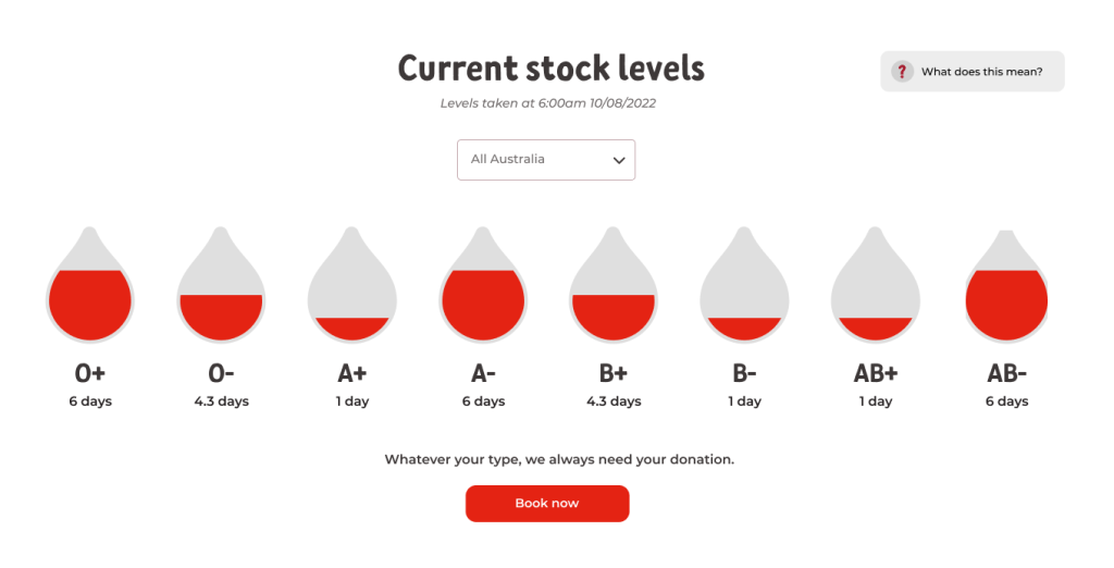
Through donor sentiment we understood that people wanted a clearer picture of how much blood Lifeblood actually holds – and when donations are most urgently needed. That kind of transparency, they felt, would help them decide when to give and which blood types were most in demand.
Looking around the world, we saw that many blood services already share stock levels by blood type. They often use visual metaphors – from blood bags to test tubes to drops of blood – to show how much is left. But what would resonate most with Australian donors? And how could we present this information in a way that motivates rather than discourages them?
Our research focused on a few key questions:
- Would seeing stock levels inspire donors to book – or risk putting them off?
- If someone doesn’t know their blood type, would they still find value in the information?
- Should plasma be included alongside blood stocks?
- Do simple labels like high/medium/low help, or is a more precise visual better?
- Which graphic style feels clearest and most engaging?
To explore this, we ran a survey with two donor segments: those who didn’t know their blood type, and those with blood type O+. This gave us the flexibility to split or aggregate the responses and uncover any patterns between different types of donors.
Blood stock levels survey results (PDF 1.3mb)
Notify Me (2023)

Donating blood or plasma is such a generous act, but for many donors the process wasn’t always smooth. Popular time slots at Lifeblood centres would book out quickly, and when someone cancelled at the last minute, those highly desirable spots often went unfilled. That meant donors missed out on the times they wanted, and Lifeblood felt extra pressure to fill open times to meet donation targets.
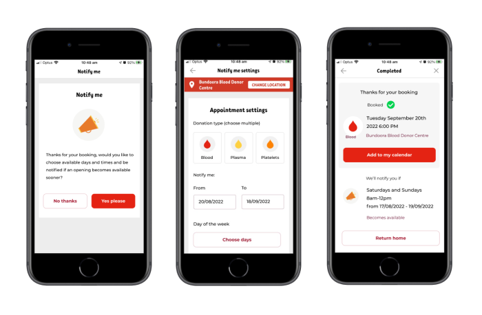
That’s where Notify Me came in. The idea was simple: if the time you wanted wasn’t available, you could choose to be notified when it opened up – and book it right away.
At first, we explored this as a “waitlist.” But in testing with donors, we learned something interesting: the word waitlist didn’t quite match their mental model. The “Notify Me” concept worked better – it felt clear, flexible, and empowering.
By reframing the idea and validating it through interviews and prototypes, we landed on a solution that would give donors more flexibility and confidence, while helping Lifeblood make the most of every appointment slot.
Notify me research and testing results (PDF 3mb)
Plasma Content Testing (2023)

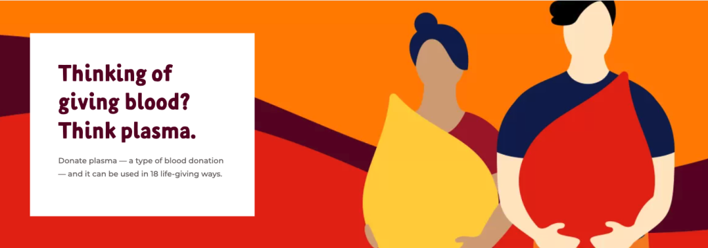
Plasma is in high demand in Australia, yet many people don’t fully understand what it is or how donating it differs from giving blood. Some hold uncertainties or misconceptions about the process, which can make them hesitant to donate.
We set out to test the content on Lifeblood’s plasma pages to see if it was doing enough to inform and reassure potential donors – clearly communicating the benefits while addressing common fears and doubts.
By observing users as they completed common tasks on our plasma pages and eligibility quiz – across both mobile and desktop – we could see where expectations didn’t quite match what the content delivered.
The research revealed opportunities to improve how information was structured and prioritised. We developed a more effective content layout and hierarchy that helped people find what they needed more easily and feel more confident about donating plasma.
Plasma content testing findings (PDF 3.5mb)